A seamless user experience will lead to increased engagement and traffic. The post provides insights on psychology triggers and their real life application.
When you win over your prospects, you turn them into loyal followers. Giving a supreme user experience can go a long way to building your brand and this following. Align yourself with the goals of your customers and you will open doors to better conversion rates.
Providing a seamless user-interaction on your company’s website should be one of the core goals of your business strategy. Here, understanding the user psyche can go a long way to meet the needs of your customers.
Here are 9 psychology triggers with actionable tips on improving your user experience.
1. Escaping paradox of choice through minimalist design
Choices give liberty and autonomy to you. They help you improve your quality of life. However, psychologist Bill Schwartz, in his book “The Paradox of choice – Why more is less”, argues that an abundance of choices can lead to depression.
A continuous increase in number of choices leads to an overload, making you anxious. Taking decisions at every step means lesser time to concentrate on the things that are the most important.
Watch the summary of his book in this TED talk.
Instruct your web designers to follow the “less is more” principle. Consumers will say that they want choices. And you might be tempted to believe it. But, it leads to decision paralysis and eventually, a decrease in conversions.
More the choices and features on your website and web application, the tougher it gets to understand your interface, therefore limit the number of choices for a better user experience. This results in higher user satisfaction and lesser bounce rates.
Strip all the non-essential features and elements from your website and mobile application. Think from a consumer’s perspective on different usability environments.
‘Are you asking too much information too soon on your website? Can the navigation be made simpler and clearer?’ Remove all the unnecessary options along a user’s journey.
Have a look at the stages of development in the Todoist app and see how they beat the paradox of choice in their UI design.
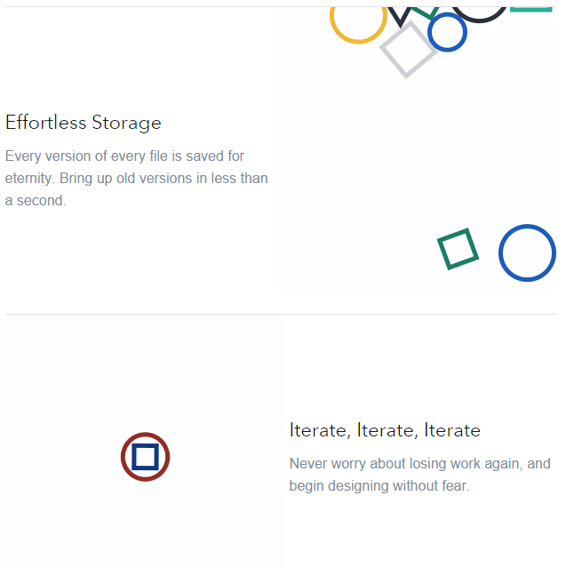
UK based Layervalut’s website is another great example of minimalism. The web design resonates with their philosophy – ‘Simple version control for designers.’
If you feel inspired, you could later check out website builder Breezi to build minimalist webpages. Here’s a tutorial to get you started.
2. Bang your first impression with an awesome value preposition
When you meet a person for the first time, you form a mental image of the person. It is based on their age, language, appearance, tone of voice, and a variety of other factors.
The next encounters in everyday work with the person will be influenced on this first impression. Hence, nailing your first impression at a job interview or a collaboration event, is important.
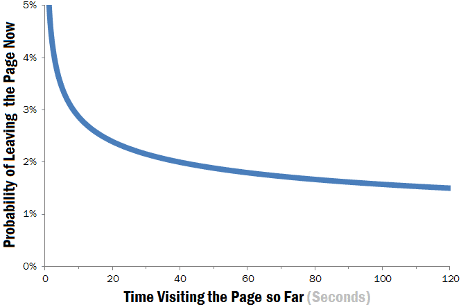
As a business, your website should amaze the customers at their first visit. With decreasing attention spans, users leave a web page within 10 seconds.
As per research by Chao Liu and colleagues, the page visit durations follow a negative Weilbull distribution. Their study of 205,873 different web pages shows that it’s rare for users to stay long on web pages.
Like I said above, users decide if they will be staying longer within the first 10 seconds of visiting a website. As the graph below indicates, after the first 30 seconds the rate of people leaving your website drops substantially.
To give an awesome first impression, your website must clearly communicate the unique value you are offering to the users.
Your headlines, sub-headlines, and visual elements should convey the specific benefits your product offers and why they are worth purchasing.
For example have a look at the headline tests conducted by Highrise.
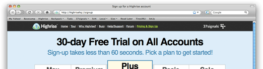
The above picture is the winning headline. It conveys a specific benefit – “30-Day free trial.” The sub-headline further clears that signing-up process as quick and time-effective.
As per a 2012 Website Optimizer Report, companies that test their value propositions are 15% more likely to produce ROI from their optimization programs.
Go make your value proposition compelling today by being clear and specific. This worksheet by Marketing Experiments should help.
3. Using symmetry, asymmetry and simplicity in website design
We are wired to create symmetry and find balance in everyday things. According to Gestalt’s law of simplicity, we perceive complex images in their simplest forms.
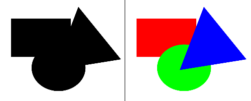
And the law of symmetry states that objects are perceived with symmetry around their centre.

That does not mean you cannot use asymmetry in your design. If you can thoughtfully craft asymmetric designs, then it will be pleasing to the eye.
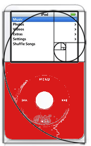
The most common example of leveraging asymmetry is – golden triangle. Our eyes scan an image fastest when it’s shaped in the form of golden rectangle.

Blogger Julian Seindenberg pointed out a slightly modified golden rectangle design in iPods.
Gestalt psychology specifies laws that make your website design more coherent and connected. We look only on symmetry and simplicity laws in this post.
The disorder that arises in asymmetrical designs can be leveraged to call attention to particular elements on your website and break boredom.
Let us first glance through some websites and their silhouettes.
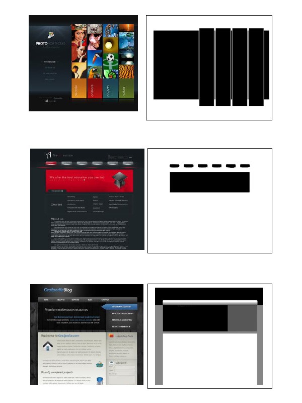
Looking at the above image should make it clear to website owners that the design should start as a whole container. The individual elements and details come later.
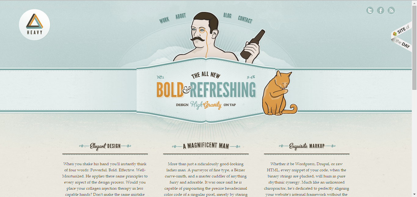
The website Forever Heavy has most of its design elements centered.
As the designs show, symmetry can be used to provide a calm and stable experience. Asymmetry can strategically be used to give character and highlight unique points of interest.
You can visit this website designed on the laws from the Gestalt Psychology.
4. Visuals are interpreted faster and better by our brains
We process photos and videos faster than text. MIT scientists have found that our brain can remember an image that we saw for as little as 13 milliseconds.
Visuals make instant connections with the information already stored in our memory. So, if the visual design has an emotional appeal, then it makes a qualitative connection with us. And this information will be retained in our memory for longer periods.
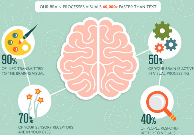
Businesses can use visuals on their website in the form of infographics, videos, memes, photos, etc. A mix of text and visual content will lead to better retention and improved user experience.
As per this Citrix study, 63% of social media consists of images and 32% of videos. This proves our craving for visual content. And its inherent share-ability can be concluded by this Pew Research study – 54% of internet users have posted their own pictures or videos to websites.
Not every business can afford to hire a top-notch designer with Photoshop proficiency. But don’t worry. You can start with designing a Facebook cover photo for your business with this ‘Amazingly simple Graphic Design Software’ – Canva.
5. Create a sense of belonging by building a community around your business
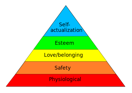
Would you not want to add meaning and value to your customer’s life? This is one of the primary reasons for starting a business. Then, it is to give people a ‘sense of belonging’. The feeling of being connected, supported and valued for your opinion boosts self-esteem.
If you can make people feel that they a part of a greater community, then you help in adding meaning to their life. Infact Maslow’s hierarchy of needs, lists a sense of belonging is the third basic human need for self-actualization.
The takeaway for businesses is that they should not consider social media as merely a content distribution platform. Engaging with the audience and forming a community for your customers is necessary.
Forming online communities can help you in generating and nurturing leads. 85% of B2B Buyers resort to social channels for evaluating products and purchasing decisions. This is a wonderful opportunity for you to interact with a prospect, realise their business challenges and help them solve those.
Moz is a brilliant example of a business that nurtures a community on their website. They host events/webinars by experts and have a dedicated Q & A section. It has developed into a great hangout spot for search engine marketers.
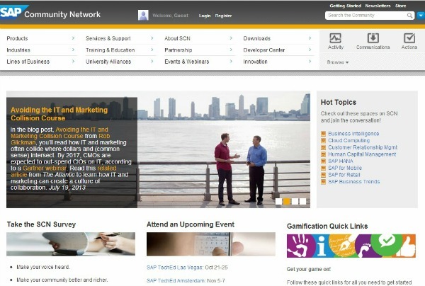
Another brilliant example is SAP. This global provider of enterprise solutions reaches over 2 million unique visits each month. The discussions forums on products and services to solve business problems have increased the adoption of SAP’s own products in the marketplace.
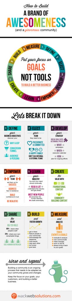
Here is an infographic to help you get started on building a community for your business.
6. Be Transparent – Don’t try to trick or sell to your consumers
Deception has been a subject of study in psychological research. Industry experts deem that deceiving is morally incorrect and might negatively affect the participants.
But some behavior researchers argue that omitting information and misleading the participants of their studies is necessary to draw genuine conclusions on their behavior.
While this deception debate might continue in psychology, businesses should stay away from trickery and exploiting consumers.
Do not make any false claims, guarantees, or hide subtle disclaimers about your products and services on your website. It will only lead to brand hate and even lawsuits against you.
Classmates.com, a social networking website had to pay $9.5 million settlement for a lawsuit accusing them of deceptive marketing emails. Allegedly, they lured users into paid Gold Membership stating their classmates were trying to contact them.

Also, choose and place advertisements, as well as affiliate links, carefully. Inform your customers about the costs associated with your products. Blatant self-promotional content is the second biggest content turn-off as per this report.
Mr. Flint McGlaughlin, a prominent business leader, feels that businesses should focus on transparent marketing. As per Flint, the post-modern customer has long been given many empty promises and artful disclaimers. So, a consumer inherently doubts every claim. Such skeptical customers can be won by being transparent.
Do you believe in transparency? Well at AdPushup, we do.
So, does Neil Patel.
And so do the guys at Moz and Buffer.
For a start, why don’t you recheck all the claims you’ve made on your product and services page.
7. Trigger emotions by storytelling
Can you recall your favorite speech? Mine is the Steve Jobs commencement address at Stanford. What do you think is the unique aspect that made this speech so likeable by people across the world? It was the 3 ‘stories’ of his life.
Steve shares the wisdom we know – find what you love and do it. But the speech is simple and powerful. It makes an instant connection and you feel motivated to follow your passion.
We are emotional creatures. We crave it all – pleasure, excitement, fear, guilt, trust. In a previous post, we covered the science behind storytelling and how it impacts our memory in detail. Do check it out.
A brilliant example of storytelling by brands is “Dollar Shave Club.”
Mike, the founder, is a great storyteller and his comical narration led to 12,000 sign-ups for the service within 48 hours of the video launch. Not a bad ROI on a 4,500$ investment, right?
General Electric is another brilliant example. They have leveraged visual storytelling to share their technology on social media. These fascinating GE stories have increased their reach, engaged their followers, and positioned the company as an innovator.
Have a look at the recent #SpringBreakIt video campaign they conducted –
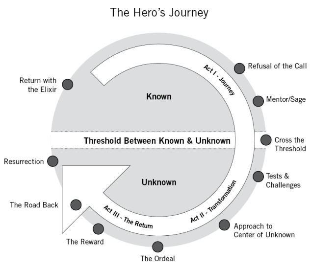
So to achieve such traction – For starters, give a personal touch to the about page on your website. Share your personal story using The Hero’s Journey 10 step model below.
8. Create social proof using social media and testimonials
Do you feel weird to be the first one to leave the office? You are scared of being the odd one out, right? The reason is “safety in numbers.” The people around us condition the way we think and behave. We like and choose things just because the people around us do.
This phenomena is referred to as social proof and is one of the six key principles of Influence – the psychology of persuasion.
As a business, the simplest social proof for your blog is the number of comments it receives and its popularity on social media.
If an article already has some 100 tweets and 50 likes than the new visitors are likely to share it themselves on social media. The social media shares reinforce that the content is good and adds value.
A terrific way to persuade your prospects is case studies. If you can get an existing customer to share his experience of how using your product positively affected him/her – it’s gold.
On your product pages, you can place testimonials by your previous customers. This asserts that your product adds value and is worth investing in. Testimonials were one of five things on the landing page that resulted in an additional $1 million worth of subscribers in a year for Moz.
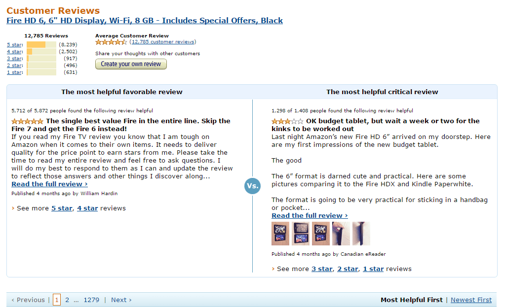
Reviews, ratings, and a “Most Popular” page are other ways ecommerce websites use enforcing social proof. Good reviews and ratings win a customer’s trust and increase the chances of a purchase. A “Most Popular” page increases desirability of the products listed on that page.
The flip-side problem with implementing social proof is – the lesser approval from customers for your service, product, or content = lesser perceived value by others. If a blog article has only 10 shares, than people feel that it isn’t good enough and will bounce.
Another setback is trying too hard and making your product page heavy. Slow loading time on mobiles is a huge turn off for customers.
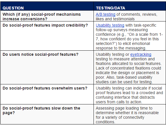
Here is a table by NNGroup you can use when you consider social proof.
9. Reinforce your central message by building marketing personas, delving into color psychology and typography
We all care primarily about ourselves. When we go for shopping, we think how a product can help us and serve our needs. And we feel at ease talking with similar people, who talk our language.
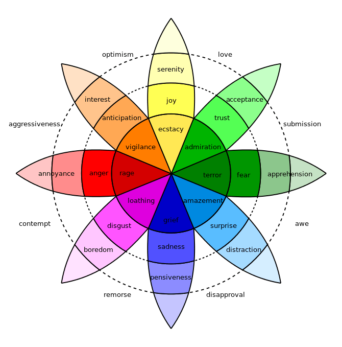
It’s also well known how colors stir emotions in us. Example – Red is associated with energy and love. Yellow is associated with optimism.
For businesses, it’s essential to build a central brand theme and remain consistent with it. Identification of your targeting audience is the first step. Create a marketing persona of the age of your target customer, his likes/dislikes, and other preferences.
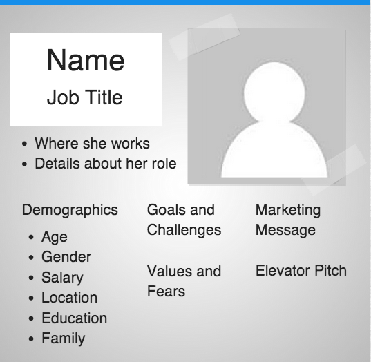
You can steal this free buying personas template by Hubspot.
While writing articles, product and service descriptions, or any other website copy, keep this persona in front of you. Imagine that you are having a conversation with this person and you aim to engage him/her. The resulting copy will give your business a human voice that appeals to your target audience.
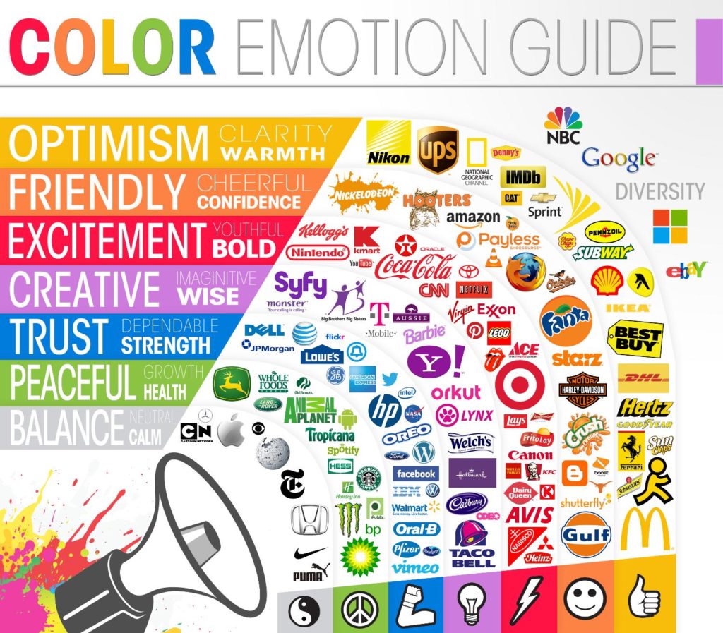
Next is using colors strategically. Again, you need to understand that your audience will have certain color preferences – In India, red is associated with marriage. And in the west, white is associated with the same. Here is an infographic demonstrating color emotions.
Think about the association of colors with your target audience and your industry. Once you choose certain colors, remain consistent with them in all your business branding material – logos, website design, social media, etc.
The last thing is typography. We have already covered how typography affects readers. Sans Serif fonts are easily comprehensible, legible, and good to read on computer monitors. But you should get creative and test other typographs. Using it strategically can make the reading experience effortless and induce moods that users will associate with your website.
Overall, you should aim to remain consistent and reinforce your central message with these 3 elements – website copy, color and typography.
Conclusion
User experience of your website tremendously affects conversions and sales. Understanding the psychology and preferences of your customers will go a long way in improving this experience.
The above psychology triggers clearly convey customers’ mind-sets and strategies to win over them. Start using one template/tool a day that I’ve mentioned with each trigger to build a superior user experience.
What are the strategies you have been using to improve the user experience on your website? I might’ve missed the psychological triggers you use. You can use the comments box below to share them.
Image Credits – NNGroup, SignalvNoise, SmashingMagazine, WolframMathWorld, PickCrew, TutsPlus, ForeverHeavy, TheNextWeb, WikiPedia, FierceCMO, Flickr, ContentMarketingInstitute, Amazon, NNGroup (Point 8), Forbes, BufferApp, TheLogoCompany
FAQs
User experience (UX) involves understanding users, what they need, what they value, their abilities, and also their limitations. In addition, it takes into account the business goals and objectives of the project management group.
Good UX design works for both your users and your platform. A well-designed user experience focuses on guiding a user to the information or resources they need, while eliminating obstacles.
There are three types of UX design
In UX design, there are three main specialties: interaction design, visual design, and information architecture.

Shubham is a digital marketer with rich experience working in the advertisement technology industry. He has vast experience in the programmatic industry, driving business strategy and scaling functions including but not limited to growth and marketing, Operations, process optimization, and Sales.