Many of us have read about case studies where a simple alteration resulted in higher conversions, whether it be increase in opt-ins, decreased bounce rate, more traffic, or even sales.
Take these for example:
- An Optin page with a smiling person increased the sign ups by 102.5%.
- A simple and more visible call to action increased conversions by 591%.
- A simple change of button color from green to red increases conversions by 21%.
This brings forth the question as to why certain design, colors and words make people react a certain way?
In this article, we are going to try to answer this question using neuroscience. We are also going to look at specific ways a blogger or website owner could go about optimizing their blog/website layout to maximize conversions.
Let’s start with the basics here.
What is neuroscience and Why is it important for design?
Neuroscience is the study of the nervous system, which consists of brain and spinal cord. Among other things, neuroscience also explores the effect of brain on behavior and cognitive functions.
Our visitors’ brain is wired with ~86 billion neurons, each acting as a data processing unit, transmitting signals generated in brain to the target organ, muscle or cell , for as small of an action such as blink of an eye.
When a visitor comes to your blog, these same neurons influence sensory perception, behavior and thought of the visitor, depending on the layout, shape, color and other factors. For most of them (the new visitors), your website is an unknown territory – a virtual piece of real estate still unexplored. When they begin to explore your site, scroll by scroll, more than just blatantly reading or looking at each element, they experience it.
For marketers and designers, looking through the lens of neuroscience is important because it allows you to understand the most basic yet crucial component of getting a person to convert – the decision making process. You can learn more about your target audience by understanding the triggers behind human cognition and behavior when exposed to a design.
The goal of the design in both instances is to create a pleasing and emotionally satisfying experience for the user, that fulfils their expectations and inspires them while enriching their experience through information, optimized usability, creativity and presentation.
Now let’s look at how you can use neuroscience to make your blog layout – brain friendly.
The Decision Making Process
People think that they are (or their neocortex is) in control of the decision making process; that they think first and then act. This is true, but in some cases, not all. In many instances, though, people act and then consciously build reasons to support that decision.
Most of the time, we don’t make rational decisions, instead we rationalize.
Lawrence Williams, a professor at University of Colorado, conducted a controlled experiment where some students were asked to hold a warm cup of coffee for a few seconds, and the other half held a cup of iced coffee, prior to reading a short description about a hypothetical man. They were then asked to evaluate the man’s personality based on what they had read.
Here is what he found: The participants who held the warm cup of coffee, had a positive view of this man, rating him as generous, happier and social. The iced coffee group had a more negative view.
The photograph and the description were same for both groups. The only difference was the temperature of the coffee they were asked to hold.
We are not that rational as we like to think we are. Our decisions are often driven by unconscious cognitive forces and subliminal cues.
Reptilian vs Limbic: The Reptilian Brain
Reptilian brain, also known as the old brain, is the programmed for our basic survival instincts (fight or flight response) and reproduction.
This is the area where the vast majority of decisions are made. According to the e-commerce guru Amy Africa, when the reptilian brain views a website, here are the questions it asks:
- Does this look familiar? – The reptilian brain likes things that it is familiar with. If the website’s entry barrier is too high with confusing navigational system or overwhelming layout, your user will most likely close the page. Right within the first few seconds of landing on your site, your visitor will start scanning for familiar items, like if the language of the website resonates with them, or if the faces of people on the website look like them or are of those who they admire.
- Does this look safe? – Due it being programmed for survival, the reptilian brain can notice discrepancies rapidly. It does not like intruders or interferences. It likes a process if it flows exactly as predicted.
- Is this urgent? – Most of us, at some level, are procrastinators. Our brain needs a sense of urgency and incentive to perform an action.
This is the reason why you will find most company logos on the upper left side of the website. This is the reason why most websites now opt for horizontal navigational patterns, in an order where Homepage is followed by about us. Contact us is often found last.
When placing the different elements on your website, an important question to ask yourself is whether the call to action button, opt in box, share icon or the blogpost links are at places where users would expect them to be at.
Let’s now move on to the Limbic system.
Reptilian vs Limbic: The Limbic System
Limbic system is the emotional center of our brain and as you can see in the aforementioned study, this is what was in play when the participants based their perception of the “man’s” personality on how they felt. They associated warmth of temperature with a warm personality.
The limbic system is mainly focused on the now – on taking instinctual decisions that will achieve the short term goals. Its decisions are always aimed at achieving feelings of pleasure and avoiding pain. It is susceptible to temptation and makes decision faster than the prefrontal cortex.
The lingual brain, or the neocortex then attempts to rationalize the decision that have already been made.
Lesson for Bloggers: Your website or blog should be worth remembering. It should give your visitors a positive experience and capture their attention. Also, you want to persuade them and lure their limbic system, by both showing and telling them why your blog is better.
Now, you have to remember that people do justify their decisions after making them. For example, if you are drinking in a bar and someone asks you why you are drinking that beer, you won’t simply say that its ad looked good, because that would make you seem weak, to yourself and to others.
Primacy and Recency Effect
The SPE theory basically helps us understand how we remember things. It states that items that are in the beginning and end of the list are more prone to be remembered than items in the middle.
The primacy effect states that the items first on the list are recalled more easily. One reason for this is that the initial items that are stored have more time to be consolidated into the long term memory. The opposite of this is the recency effect, where items on the bottom are recalled easily. One reason for this is that these items are still fresh in the working/short term memory.
Lessons for Bloggers: While designing your blog, place the important elements like call to action both at the top and the end of your page. When designing the navigational menu, do not place important section of your website in the middle. If you are using ads to monetize your blog, you know now where NOT to put your ad units.
Intuitive Web Design
I bet you hear this often. Your visitors don’t have time, but then they leave your site and spend hours on Facebook or watching Youtube videos. Here is the more important question to ask: Is your Web design asking too much from your prospects in terms of physical effort, mental effort, time, or too much info?
People have mental models, and your design or layout should strive to match that mental model to the best of its ability. Mental models are thoughts or assumptions of how something should work. They are based on past experiences and intuitions.
Now here is the problem. Most designers design websites to be intuitive, but intuitive for themselves, not the target audience. They do this unconsciously. This is why market research is very important.
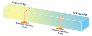
Jared Spool describes it with his Current Knowledge vs. Target Knowledge theory:
Current knowledge is the pre existing knowledge the users come to your site with. Target knowledge is what they need to access your website effectively. Knowledge gap is the difference between current and target knowledge.
While planning a layout, your job should be to keep this gap to a minimum. For example, here are some things that people expect on any website:
- Clicking on the logo leads them back to the homepage.
- The last link on the navigational menu (vertical or horizontal) should be contact us.
- Text is aligned left.
- The links are of a different color, like blue.
- Same navigation style and other elements is consistently present throughout the website.
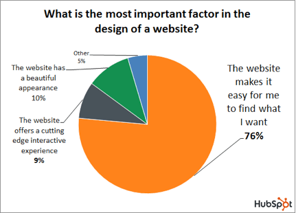
Lesson for Bloggers: Here is an interesting finding by Hubspot, for 76% of the people finding what they want is the most important thing. Keeping the navigation simple is the way to go. You can remain creative and it’s good to be different, however, the overall experience should still remain intuitive for the visitor.
Power of Stories and the Power of Flow
Any designed object, including a blog, can tell a story through the use of form, materials, brand and graphic metaphors to conjure up a time, a place, a mood and a moment. Jonathan Gotschall, author of ‘The Storytelling Animal’, explains that humans are addicted to stories and the stories are nearly all the same. Stories universally focus on the great predicaments of the human condition: sex and love, the fear of death and the challenges of life. And they are about power, the desire to wield influence and escape subjugation. This can be used to evoke emotions, which trigger a large part of the brain’s response. Stories can be short (like television commercials or songs that tell short stories) or more extensive, like an entire blog that is devoted to telling a longer, on-going story with both words and images. An effective story will hold the reader’s attention for a longer time and produce a deeper level of engagement with the blog.
Lesson for Bloggers: It is easier to get people to read your blog post than it is to bring them back to read another one. But here is a trick. People love stories, people love flow. A series of blog posts where people slowly uncover, post by post, the big picture, will make them come back for more.
For new users, you should always link to the Next part and the Previous part, on the bottom and top of the blog post they are currently reading.
Another point to note is that your blog layout has the power to tell a story by itself. Without reading, your visitor should be able to have a general idea of what your website is about. Take a look at TMZ, CNN, the Guardian, and you can tell differences and similarities just by taking a quick glance.
Visual Processing and Cues
Considering that over 50% of the brain is devoted to visual processing, you can understand the importance of visual experience in creating a better blog. This is further verified by the moves of internet giants like Facebook, favoring images over text, and Google through its acquisition and promotion of YouTube’s video content. Visual components should be utilized carefully, and not just added for decorative value.
Here is an interesting study done by usability expert James Breeze that shows that images of faces can be used to guide people around website . The following images show eye-tracking study results:
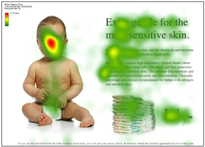
Notice that when the baby is facing forward, the viewer’s attention is more strongly directed at the baby’s face (above). But notice what happens when the baby is looking at the headline (below):
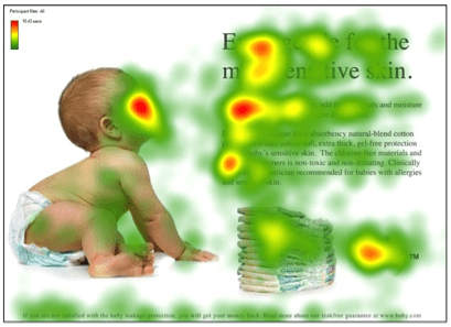
Here the visitor looks at the baby’s face for a few seconds and then shifts its focus to the headline, where the baby seem to be looking as well.
Lesson for Bloggers: Faces can be used as visual cues. Not just faces, but symbols like arrows or dots, you can use these to draw attention to an opt in box or call to action. When used strategically, like the ones used in the middle of this sales letter can also create and eye path for your visitor encouraging them to scroll down.
If you can find a way to combine the archaic conventions that most visitors have come to expect and assume from every website while still being able to add your own unique magic spin, then you have created a design masterpiece.
People have ninety nine problems already. So using your website should not be one. Keep that in mind and your blog will convert. Goodluck!
Ankit is a co-founder @ AdPushup (a tool which helps online publishers optimize ad revenues) and loves online marketing & growth hacking.