Blogging has become a worldwide obsession. In 2011, Technorati reported that there were over 184 million blogs online. The results of a survey published by blogging.org showed that despite their burning desire to make a living online, 81% of bloggers have never made more than $100 from their sites.
We could easily link the lack of earnings to multiple causes, but there is one glaring issue that eclipses all of the other factors; websites are not able to generate enough traffic or even worse, visitors are leaving websites before making a purchase, clicking on an ad, or following through with whatever monetization channel the blog owner has put in place.
This may not have anything to do with the quality of the website’s content. If it isn’t the content that is scaring off web traffic, then what is causing people to bounce?
Believe it or not, there are specific psychological reasons as to why some visitors decide to avoid staying on a site for an extended period of time. Luckily, if you fall into the 81 percentile of those that aren’t making a solid income, there is still hope.
By making some small changes, you could easily decrease the bounce rate and improve visitor engagement, prompting viewers to make a purchase or return at a later date.
So, let’s explore the biggest reasons which can cause traffic to bounce from a website:
Speed
In our ever growing technological age, society tends to insist on instant gratification. Our impatience is apparent wherever we go, but in no place is this more evident than the world wide web. Online, the average user lacks the patience to view a site that takes too long to load. The internet analytics groups, Akamai and Jupiter Research found that nearly half of all web users expect a page to take no more than 2 seconds to load, with 4 seconds being the average threshold.
The same study showed that a delay of 5-6 seconds for a page to load was met with over 30% of people closing the site in frustration.
We have also seen a drastic decrease in the overall attention span of the Internet visitor. In a study conducted by the Department of Informatics, at the University of Hamburg, researchers discovered that after following the web usage of twenty five participants, the average attention span was only 8 seconds.
Only 13 years ago, this attention span was about 12 seconds. What’s even more interesting is that the average length that users spent on each page was incredibly low.
“Participants stayed only for a short period on most pages. 25% of all documents were displayed for less than 4 seconds, and 52% of all visits were shorter than 10 seconds (median: 9.4s). However, nearly 10% of the page visits were longer than two minutes.”
“Even new pages with plentiful information and many links are regularly viewed only for a brief period – an interesting background for Web designers, who could focus on offering concise pages that load fast.”
This shows that visitors today lack the patience to wait for a page to load, often opting to avoid pages that are slow.
The answer to this problem is improving your website’s speed. That may mean dropping some dead weight such a flash media or large images. It could also be helpful to minify your scripts, use HTTP Compression and cache. A bigger step would be to use a Content Distribution Network (CDN).
Color Psychology
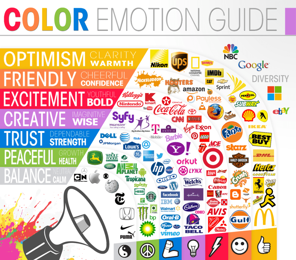
Human response to colors has been widely researched for many years. Coordinating colors to correspond with your target audience has been a ploy that marketers have been using for quite some time. We now know that colors have the ability to evoke specific emotional responses and even influence certain behavior. This knowledge is absolutely crucial in an online environment where sight is the primary sense utilized by viewers. Whether it is due to evolution or a result of sociological “priming”, humans tend to associate certain colors with feelings and objects.
An article created by Pod1 illustrates the differences in human perception that colors can create.
Specific colors tend to evoke certain emotions when seen online:
A compilation of studies posted by Color Matters decided to delve deep into the difference that gender plays when perceiving certain colors and color combinations.
Key Differences in Color Perception Between Gender
Women:
- Prefer small or very large differences in hue rather than medium differences
- Prefer Red over blue
- Prefer yellow rather than orange (women placed orange at the bottom of the list)
- Prefer blue-green more than men do
- May be more “color conscious” than men
Men:
- Prefer medium differences in hue
- Prefer blue rather than red
- Prefer orange rather than yellow
- Prefer achromatic (void of color such as grays, white, and black) more than women do
Professors Karen Schloss and Stephen Palmer of UC Berkley have come up with what we know as the Ecological Valence Theory as it pertains to colors. Up to this point in time, the majority of color psychology had been primarily focused on what colors are preferred.
Schloss and Palmer took it a step further and attempted to identify WHY humans prefer certain colors. The theory suggests that color psychology is due to an adaptive process that originated from our earliest ancestors.
In short, humans have innate preferences to certain colors because people are more likely to reproduce successfully and survive longer if they are attracted to colors that they deem “look good” while also avoiding colors that they sense as “bad” or “unsafe”.
For instance, people are far more likely to be accepting of the color blue, because the color blue appears in nature with things that are associated in a positive manner such as fresh water or a clear blue sky. The color black on the other hand may have negative connotations to some as it naturally occurs in nature in dark areas that are void of light that may be dangerous.
Of course, that doesn’t mean that the color scheme of your blog absolutely needs to coincide with what a color wheel suggests. For instance, though the color black may be off putting to some, it may be seen as a sign of power to others. The color scheme of your website should coincide with your target audience and the nature of your blog. If the majority of your viewers are females, then perhaps a lighter colored theme would be sufficient. For males, darker colors may be a suitable choice for a background.
Readibility and Font Hierarchy
If you frequent social media sites, then it’s quite likely that you’ve seen something like this before….

What’s even more likely is that you can actually read an image containing a bunch of jumbled letters as well as you would if they were in order. I know what you’re thinking and this is no magic trick or optical illusion. The reason you can actually comprehend these words is because your mind does not see the individual letters, only the word as a whole.
In other words, your mind scans instead of sounding out each syllable. This is incredibly important for bloggers to understand when creating certain aspects of their website.
According to the Nielson Norman Group, as many as 79% of people employ a scanning technique when browsing the web. According to their research, people don’t read word for word, but will key in on areas that are bolded or accentuated in some way. This is why following a specific font hierarchy is so pertinent to your blog’s success.
“On the average web page, users have time to read at most 28% of the words during an average visit; 20% is more likely.”
By creating content that highlights the key points that is also easy on the eyes, reader can scan over the information and still absorb the most important parts. For instance, titles, headings, and subheadings should be distinctly different in size and stand out compared to the rest of the text. Additional bullet points and spacing in between long paragraphs can drastically improve readability as well.
In the study provided by the Nielson Norman Group, the researchers tested the readability of a website that was written in five different ways. They ensured that the formatting and typography was different for each version, despite providing the same basic information.
They then tested each subject in measured usability (task time, errors, memory, time to recall site structure, and subjective satisfaction). They found that the website that had concise text, objective language and scannable layout scored an incredible 124% usability rating over the control version.
What this all boils down to is that readers need to view information in a way in which it can be absorbed as quickly and effortlessly as possible for maximum satisfaction. That means well written content that is broken up into short paragraphs, with well defined points of interest for higher comprehension.
Banner Blindness
The term “banner blindness” doesn’t just apply to flashy banner ads. It pertains to any aspect of a page that is displaying information in a banner like format.
It is possible that if you employ a lot of flashy “in your face” elements onto your site, your viewers may be missing information such as basic directions or links.
This is an interesting phenomenon as it runs counter to the belief that promotional elements of a website need to stand out among the rest of the information in order to be seen. Instead, it seems that too much flashy ads could just be useless clutter damaging the overall aesthetics of a web page.
Two of the most popular researchers on the topic of banner blindness are Jan Benway and David Lane from Rice University. Throughout their studies, these two researches have shown time and time again that most people will gloss over the most visually prominent items to click on other less-prominent items of a page, even if both the links pointed to the same URL.
In a pilot study, Benway and Lane provided a small homepage with a menu, and some text with 3-6 links placed within. Also contained on the site was a large gaudy banner ad, advertising a hotel. The subjects were asked to find specific information (hotel’s email address). Image of the page is shown below:
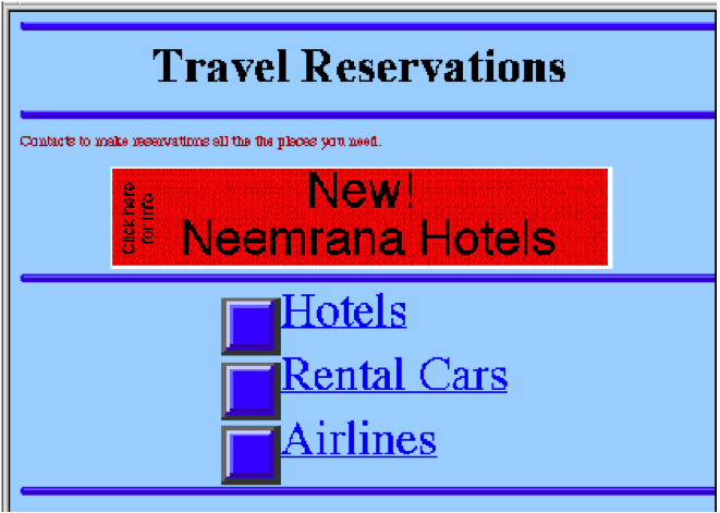
The results? Despite being bright, flashy, and providing a shortcut to the intended goal (receiving an email address from a hotel) very few people actually clicked on the large red ad. To some, Benway and Lane’s test results almost seem comical as it would seem impossible to miss the intended banner, but banner blindness is a very real component.
“The pilot study demonstrated that banner blindness occurs, although some users will eventually find the banners when forced to (i.e., when there was no other way to find the required information). The second experiment showed that in some cases, banners will be almost entirely missed by nearly all searching users. Use of a small amount of animation and common region grouping did not mitigate the effect. It also showed that “banner” blindness can occur with text items that do not look like advertisements.”
It’s important to realize that it isn’t just ads that get passed over by viewers, but items that are seemingly too flashy. An impeded ability to navigate a website will severely decrease a user’s satisfaction and cause them to leave the site rather quickly. An easy way to fix this situation is to ensure elements do not stand out (becoming too flashy).
In you’re interested in learning more about banner blindness, you can ready my previous post about how humans read web pages.
Here Is How You Keep Visitors From Leaving Your Blog
There may have been a copious amount of information to take in with this post, but the steps to improving the overall performance of your site by decreasing the bounce rate is actually quite simple.
- Decrease your load time: The faster your blog, lower your bounce rate.
- Colors: Use a color combination that is pleasing to the eye and is appropriate for your blog subject and fits the perceptions of your target audience.
- Readability:Understand that the majority of people scan through text. Make it easier for them to do so by breaking up large paragraphs, prioritizing essential information, and creating a pleasant flow with your text.
- Banner blindness: Remember, banner blindness doesn’t just pertain to ads, it can also encompasses other areas of the page that present information in a banner like format. Differentiating specific pieces of your site is an easy way to attract viewers to those areas, but it is also easy to overdo it, so use it sparingly.
Hopefully, by following these four steps, you can increase your viewership and strategically decrease your bounce rate. If you have any comments or suggestions, feel free to post them below.
Ankit is a co-founder @ AdPushup (a tool which helps online publishers optimize ad revenues) and loves online marketing & growth hacking.