
What are Heat Maps? Learn about types, benefits, steps for creating heatmaps, and what they mean for publishers.
A human brain can grasp an image in just 13 milliseconds, which is at least 60 thousand times quicker than processing a text. Visualization tools are captive, engaging, and much more easily comprehensible on the receiver’s end.
On a daily, the total capacity of data that the internet loads is beyond our comprehension. This is why data visualization becomes not just helpful but essential to the success of a business. It can do wonders for your business – shorten your meetings by at least 24%, increase the efficacy in finding out information by 28%, and invest in visualization techniques that can offer a $13.01 ROI for each dollar invested.
After all, if you were to go through each piece of data manually to work your decision-making, it wouldn’t be half as effective or quick as a simple image might convey. But how do you fit such large bundles of information in just one image? Well, the answer is simple – Heat Maps.
Also Read: Reducing Banner Blindness: How Humans Read Webpages
Points to be Covered
- What are Heatmaps and Why are They Used
- 6 Popular Types of Heatmaps
- The Advantages of Using Heatmaps
- How to Use a Heatmap
What are Heatmaps, and Why are They Used?
All business goals are aligned with growth. And heatmaps are deemed to be one of the key data visualization tools that account for at least a 10% increase in bringing in leads.
Publishers, affiliates to sellers all take the aid of a heat map to understand how the audience receives or engages with a post. And for a content creator, it is essential to know how each post performs.
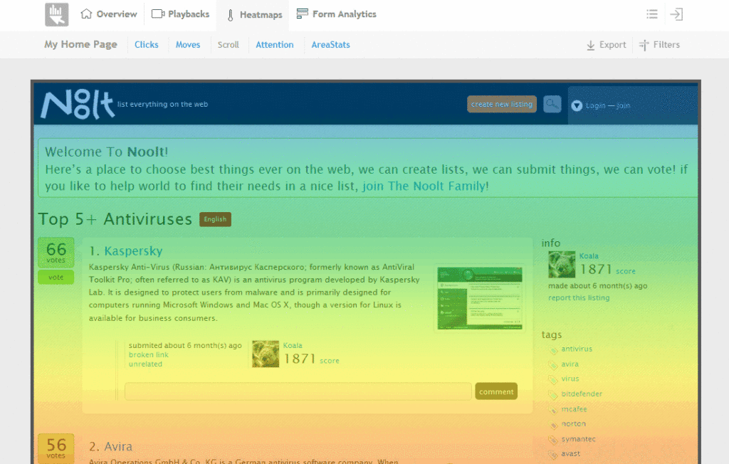
Thus, heat maps are a data visualization and analysis tool that is used to convey more clearly and precisely the user behavior on a specific content, page, or product. It works on a similar plain as a bar graph but is much more detailed and multi-dimensional.
It can offer insightful information that one can use to better their management and performance, information such as the number of visits, how long they tend to engage with the content, and tapping deeper into the minute details of the user experience.
Here are a few examples of what a heat map offers to publisher’s goals, providing an understanding of:
- Better placement of necessary page elements
- Why bounce rates are high
- Which elements perform positively or negatively with the audience
- Which are the high attention areas in a webpage
- Why there’s not enough lead conversion
Also Check: The Display Lumascape: Overview, Components, and AdPushup’s Role
6 Popular Types of Heat Maps – Publishers Should Know
Scroll Maps
Source: MouseStats
These are the kind of heat maps that offer you insight into how many visitors are there and how further they scroll down through each portion of your webpage, assess which is the exact portion that people tend to abandon the page and explore further into the layout performance of the pages.
Click Maps
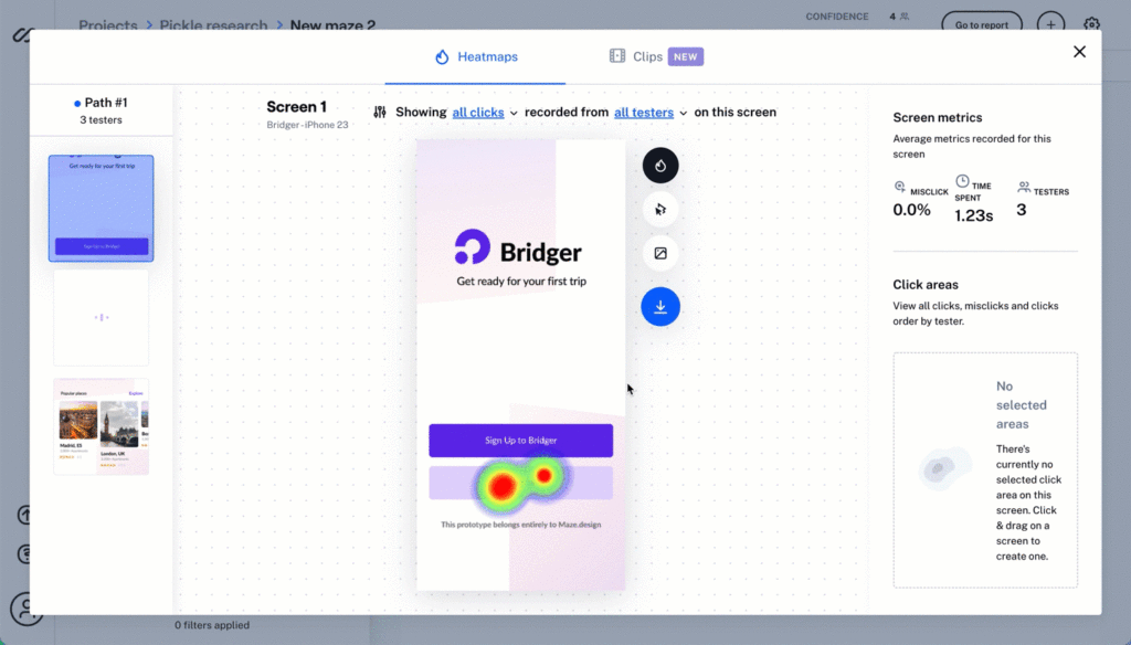
These are the kind that explores the click analysis i.e. what portions of your web pages receive how many clicks. Say you want to find out how many have clicked on the CTA or the provided product links. Click maps will provide you with an idea of the nature of the interaction.
Warmer colors in the map usually denote the high click areas, and cooler colors denote the elements you might need to work upon.
Mouse Tracking
Mouse tracking takes a step further into how heatmaps work and assesses the high-attention areas by finding out how long the cursor is hovering over a certain point. When going through a webpage, we tend to hyperfocus on certain portions, reading every word while also skipping certain portions.
Mouse tracking captures this information showing you which areas are working well with the audience and which are not.
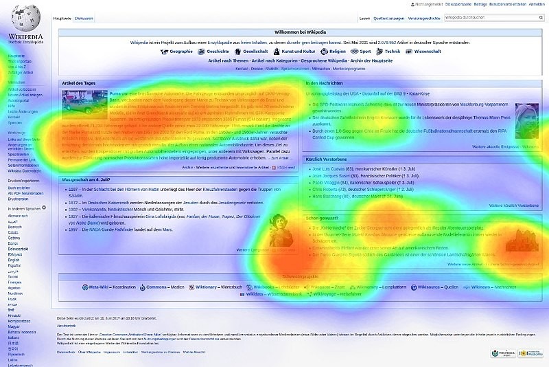
Eye Tracking
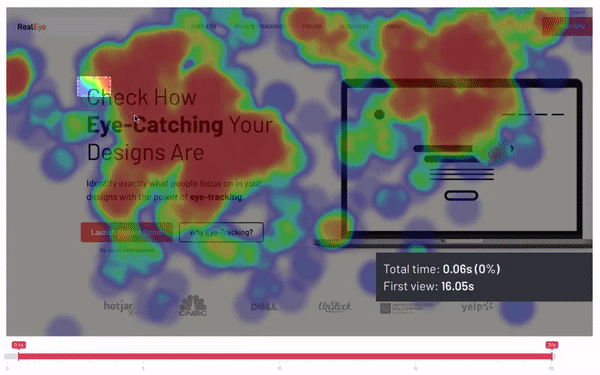
Eye tracking is a more obscure form of heat map used by publishers as it doesn’t offer as much of an inclusive report but works much more accurately for the people who do use a webcam. It captures the heat map of which areas of a webpage receive the most attention from your users.
This is by monitoring the movement of the eyeball. However, not a lot of people will enable you access to that, so it might be tricky to avail of this.
Confetti Reports
Confetti reports work somewhat similarly to that like click maps. However, the latter conveys which areas are receiving higher clicks. On the other hand, confetti reports provide insight into each click.
Thus, this can reveal the negative interactions on a page. Say a user keeps clicking a certain link or portion which isn’t working or interactive, accounting for their frustration and increasing bounce rates. Confetti reports narrow down on this specificity as to how many users are becoming attentive to what element.
Desktop and Mobile
These are usually to offer comparison and contrasting views. Web pages on mobiles and desktops appear and work differently, thus accounting for variations in engagement. Desktop and mobile heatmaps are differently used to answer this, what is positively reacting with the users on the desktop and how that can be applied to the mobile version and vice versa.
The Advantages of Using a Heat Map
Heatmaps can be understood and worked with by anyone and everyone, even without heavy IT skills. But comprehensibility is not where the benefits of a heat map end. Here’s why you should be using a heat map for your data analysis.
- Heatmaps provide a clear view of your website’s performance, alerting the appropriate parties to the issue right away.
- It conveys the necessary much quicker than pages of insightful data. Thus, quickly letting you root out the problem and come up with the solution.
- It offers a better middle ground between publishers and advertisers or any party concerned to convey the information much easier than providing bland and confusing numbers.
- Heatmaps are a key tool in measuring growth. Thus helping companies get better with lead conversions, increasing awareness and engagement, and so on.
- You can get firsthand information from your already available users as to how you can do better than taking advice from a professional, attending a course, and tending to other measures.
- Heatmaps are a great way to get real feedback as to what is capturing your audience’s attention and what is frustrating them about your page.
Read More: How to Find the Best Ad Placement on Your Website?
How to Create and Use a HeatMap
Heatmaps are incredibly insightful, and here’s how you can create your own.
Step 1: Use a third-party tool or application to create your heat map.
Step 2: You would either require to input the webpage URL or enter the HTML code, which you can access from the “view source” section in your browser.
Step 3: The application will automatically identify the elements in your webpage and show you the results. However, if it does fail to capture elements, you will usually find an option to edit your inputs.
Step 4: This should provide you a regular tracking of every move, click, scroll, hover, and further, and you can evaluate the performance over time.
Heatmaps can be used for multiple functions and in several ways by combining them with other analytics tools and so on. They are applicable in A/B testing, helpful in redesigning websites, content marketing, assessing the usability of the audience, performing analysis to optimize for conversions, and so on.
Now, Let’s Explore Deeper into How you can Use it to Improve your Ad Performance
Step 1: Now that you know how to create a heat map, it’s time to analyze one. Your first plan of action is to find out what are the problem areas in your performance i.e. poor, performing webpages or lack of conversions or interactions, and so on.
Step 2: Now asses why you are facing the respective problems – is the search bar not well placed and visible, is the CTA getting lost in the content, are there too many ads, and so on. You can take your guess and make the change, and always take the A/B test to assess the performance of those changes.
Step 3: Create further heatmaps and different types of them for each problem area to keep monitoring their performance.
Step 4: The heatmaps will provide you with the needful insight to explore and under your data and use it to your benefit. As it can provide you with the following essential information – users clicking and interacting with elements that aren’t clickable, users bouncing or ceasing their scrolling at which respective areas, users finding what content or element is more engaging and how you can apply that elsewhere.
Step 5: Heat maps do not promise 100% accuracy, but they are extremely helpful. So, what you can do is compare the analysis with reports from other analytics tools such as feedback reports, analytics, surveys, and so on.
Wrapping Up
Heat maps are a good medium to assess the density of your profile and understand how well you are perceived by your audience. Heat map analysis has become a steadily practiced method by many industries, as it is not only a great tool for analysis but of communication with clients. After all, what would you prefer, bundles of written data or colorful visuals that convey the same message?
There are also plenty of platforms available that enable different kinds of heat maps of all the data on your platform, so your work gets easier. So, get ready with your website heatmaps and start analyzing your steps to a successful establishment.
FAQ
Heatmaps are used by almost every other industry and personnel, but more so popularly in marketing to determine user behavior and how a specific content or webpage is performing. Heat maps provide the necessary feedback on what needs to be improved and what is not.
The main drawback of using a heatmap is that the information provided is not in real-time, and certain types, such as tracking mouse movement, may not be appropriate or completely accurate in determining user behavior.
The best heatmap tools in the industry are MouseFlow, CrazyEgg, Hotjar, Lucky Orange, Smartlock, FullStory, VWO, and so on.

Shubham is a digital marketer with rich experience working in the advertisement technology industry. He has vast experience in the programmatic industry, driving business strategy and scaling functions including but not limited to growth and marketing, Operations, process optimization, and Sales.