A brief guide which highlights the important “must-haves” and “to-dos” for a blog design optimized for mobile devices.
Mobile technology is no longer a concept of the future. It’s everywhere now. Mobiles are not used just as communication devices but to do the same tasks that desktops do. No wonder mobile exceeded PC internet usage in January 2014. We are past the mobile tipping point as this comScore report shows.
It is more important than ever to dig into mobile user behavior, needs, and preferences. A seamless mobile blog design is now a competitive necessity.
Users attach with brands faster on mobiles compared to any other device. The reason – It is physically closer to them (when held in hands) and always with them. Hence, the psycho-cognitive factors are stronger. The emotional connection is also stronger.
By offering a good mobile experience, you can convince your brand haters to like you.
Further, after Google’s mobile friendly update websites with responsive designs are getting a higher page rank in Google search results.
In this post, we discuss all website elements you need to keep in mind for a wonderful mobile experience – user interface, content, website design, advertisement, and apps.
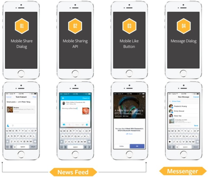
Human-Mobile communication system

As per Claude Shannon’s information theory, a communication system comprises of two modules. The first module comprises of information and destination.
The second module is the communication medium that transmits the said information, from the source, to the destination. Every communication channel has a upper cap that limits the amount of information that can be transmitted through it.
For example – if you have a 50 Mbps internet connection, then your computer should receive 50 million bits per second under best case scenario. This is channel capacity.
Now when users engage with a technological device, they form a communication system. The capacity of this channel is determined by the combined characteristics of the device and the human like –
- Device screen size
- Working memory (of the user)
- User’s attention span
All the above 3 aspects limit the capacity of communication channel. Users are able to read limited content in one shot on a smaller sized device. Now, if they navigate to the next page they will have to use their working memory (which is limited) and an average session duration on mobile is just 72 seconds.
Now, should the above limitations lead us to stripping down every feature of our products to the bare minimum? Nope. We need to organize and prioritize them.
On mobile, you can get richer insight on your app/website using camera, microphone, GPS, gyroscope and touch. You have to think how a mobile can enhance user-experience, rather than simply stripping website elements.
Let’s look at some of these techniques with user interface.
Fitt’s Law of movement
Paul Fitts designed this human movement model for a human-computer interaction. It predicts the time required to move to a target area. The model is valid for both virtual and physical touching of an object.
Its approximate formula is –
MvT = a + b log2 (D/W + 1);
MvT= Movement time between two spots,
a and b are slope and intercept (determined experimentally),
D= distance between origin and target,
W = width of the target
Takeaways from the Fitt’s law for interface design on mobile and tablets
Here are some user interface lessons by application of the Fitt’s law on mobile and tablets.
-
The distance between say the logo of your company (at the top of the page) and the call to action at the bottom i.e. D, must be less. This equates to minimal scrolling for the user.
-
The width of the call to action i.e. W, should be large. Else, the chances of the user landing on the target will be less.
-
In case your users have a considerable chunk of children, the disabled, or the elderly, then you must consider their limited motor skills in your design.
-
On mobile in vertical orientation – You need to keep the high-risk buttons like close and delete away from highly used targets. On the small smartphone screen, you can use the classic “swipe left to delete” action that requires considerable effort from the user. This prevents accidental triggering of high-risk actions.
-
On mobile in horizontal orientation – In this orientation, a user can simultaneously use both his hands. Now, Fitt’s law will apply at two places concurrently. In the horizontal orientation, reaching the middle of the screen is difficult. It requires additional stretching and increases the movement time. So, the high-risk actions (or the rarely used ones) can be placed at the middle area.
-
On tablets in vertical orientation – In this orientation, most people hold their devices from the top. Or when typing, they hold it from the bottom. So, the top and the bottom serve as the most important zone for placing your call to actions.
-
On tablets in horizontal orientation – Mostly users will use both hands to hold their device in this orientation. This is a comfortable position for the user – he can access almost the entire touch surface in it.
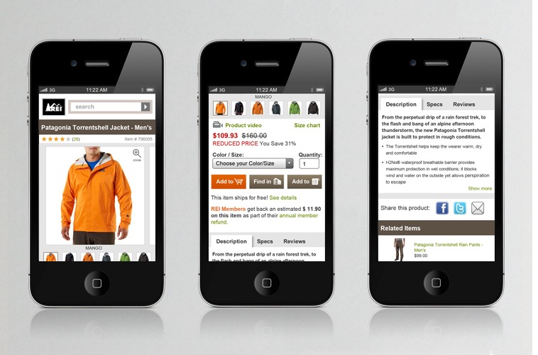
How we read on mobile
As per a 2011 iPhone reading study by SensoMotoric Instruments – most users (58%) only scan content on mobile, 38% only read the headlines, and only 5% actually read.
On a mobile, a user reads the sub-headings and quickly navigates to the bottom of the webpage. Visuals in form of images and videos can replace text altogether on mobile.
The image below shows an example of how the process of human mobile interaction is designed-
Crafting content for mobile
The above study clearly indicates that users will hate filler and subordinate quality content on mobile. Another study indicated that the comprehension of complex content is 48% lower on mobile as opposed to desktops.
When creating content for mobile – Make sure you offer a good experience by prioritizing content and using sub-headings, bullets, and visuals that clearly convey information.
But what about long-form content, should separate content for the same page be crafted for mobiles? The solution to long-form content on mobile is using accordions.
Users will scroll down if they find relevant content. The mini-IA in accordions can make users happy by helping them understand the structure of the page. This way they spend time efficiently on the topic that matters to them.
Remember a good design is an integrated part of the content. So, non-mobile optimized websites are a huge turn-off.
Designing your website for mobile
An important design aspect on mobile is that it is not just a visual medium. Touch and tap make it physical. Hands will explore your website on mobile medium. It should feel good besides looking good.
Some typical features of a mobile website include zoom, double tap, and pinch functionality. It is important to setup these before you concentrate on other elements of design.
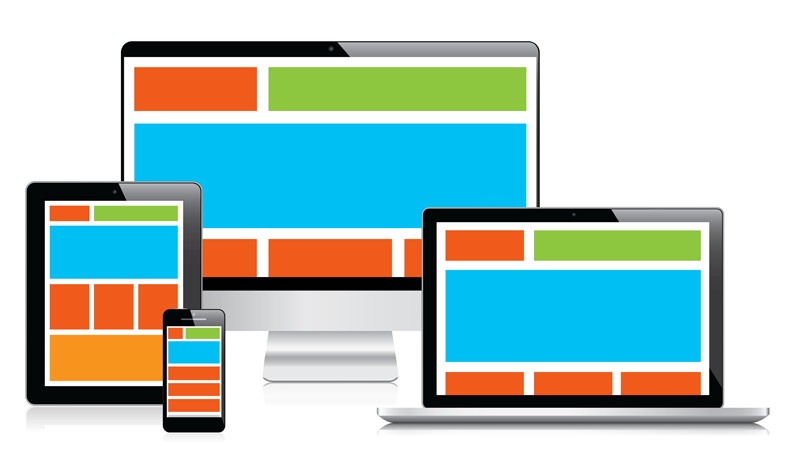
Exploring responsive web design (RWD)
Your blog design is not created for a particular channel, like a 5-inch smartphone. Based on any screen size and the orientation of device, the elements on your website reshuffle which is where responsive design comes in.
Responsive web design involves making dynamic changes to your website based on size of the device.
Technically speaking, the HTML served to all the devices is the same. The change of appearance is achieved using CSS, which detects the size of the screen.
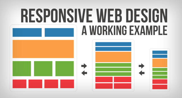
The same information need not be served across all devices. On mobile, based on the needs of your users, elements and functionality like background images/secondary content can be hidden.
Its major advantages are –
- RWD as opposed to distinct sites for different devices is easier in maintenance and requires lesser expenses. This is because a single codebase and content is used.
- Responsive design can accommodate every new device that arrives in the market. It is not prototyped for a particular 5-inch or a 15-inch device and a particular mobile operating system.
The biggest challenge with RWD is slow performance. The changes to appearance of your website occur on the client side. This happens only after the target device has received web elements and all your code. A mobile data connection is not the same as your desktop broadband connection. So, it can lead to tremendous loading times.
Is RWD good for your business?
- If your website is primarily focused on content – a corporate website, news website, or blog, then RWD is a good choice. All elements can resize and reshuffle as per the size of device.
- But, if your website has some complex functionalities, then, a RWD might lead to bad user experience.
You should consider conducting usability tests to check how a RWD works on your website. Don’t get a general overview of how a popular RWD framework works. You need to dig in and see how the content and functionalities of your website behave on different devices.
Should you go for a dedicated mobile website?
This is a strategic decision that you need to take keeping your business audience in mind. The benefits of a dedicated mobile website are – better load speed due to lighter size and targeted information.
The problem with them is they have separate URLs – from www.yourdomain.com to m.yourdomain.com. You will need to handle redirects properly so that your search engine rankings don’t suffer.
If you are an e-Commerce business, then a dedicated mobile website is advisable. You will want to give a smooth purchase journey to your users at an optimum speed. The product pages and purchase options should be free of clutter.
Are mobile apps good for your business?
Mobile apps can be a different article subject altogether. But, let us briefly discuss them in this post.
A recent COMscore study revealed that most of the digital media engagement (52 %) in the US now takes place on Apps – beating the time spent on desktops and mobile browsers.
The benefits of a mobile app are manifold.
- They are targeted for specific actions and features. Hence, there is a better chance of action from the user.
- They give better insights of user behaviour, customer trends, and in-depth user data compared to other platforms.
- Apps are faster than mobile websites and might not even need an internet connection.
If your product is feature-rich and requires users to complete specific tasks, then, an app can help your business. They can be designed around the core needs of your customers. And they will brand you in a better position compared to your competitors.
The backdrop is you might need to design an app for every mobile platform based on the devices that your customers use. The maintenance of every app will be another pain. This means a significant amount of investment and running the risk of spreading yourself too thin.
In conclusion, don’t shell out dollars because every business is developing an apps. Mobile users are unique in terms of their needs and intents. The best thing to do is research why your customers are on mobile and the devices they use.
If you get a considerable amount of direct mobile traffic, an pp will be useful for your business audience. Develop an app only if it serves your long-term business goals.
Serving advertisements in mobile environment
Every new release of a mobile phone with extra-loaded features makes the users more dependent on them. This dependency has led to users being emotionally attached to their phones.
Due to this attachment, you need to make sure that users don’t feel like being ‘forced’ to consume ads. Take some responses from the users. Make them feel they are a part of decision-making and they consume ads of their choice.
According to a psychological study, users who are more attached with their mobile phones find mobile advertisements less intrusive.
On mobile, there are many opportunities for a user to interact with an advertisement. Higher exposure time equates to higher brand recall.

You can achieve higher engagement by getting creative. Make use of the mobile device functionalities like GPS and touch. A static banner ad is unexciting. Expand and animate it. Get humorous and allow social media sharing of the advertisement.
As per a survey by Zogby analytics, 35.7% of US internet users find cheap or free apps (with in-app ads) the most appealing. Q3 2014 InMobi report supports this – Ads in mobile apps have 2.8x higher CTR than ads served on mobile web. Similarly, the average eCPM for advertisements in mobile apps were about 2.5x times that of mobile web.
We can safely say – if you want to serve your own or third-party advertisements on mobile, then apps are the best.
Why you should not use login walls
Login walls are the sign-up forms you display to a new user. In order to access the content on your website, you may be tempted to ask users to create an account by using these walls.
Understand that users login to your website/app rarely to get specific information. Requesting information on a user’s first visit without showing them the value of your product is asking for too much.
Unless your offering is very personable, like email or banking, you should ditch login walls. They have a tremendous interaction cost.
Don’t forget that deleting your app is merely two taps away. Unless users are highly motivated to interact on your app i.e. if you are social networking website like Facebook, they will migrate to your competitor’s app.
The benefits of signing up should be evident to a user for login walls to work.
Similarly, for ecommerce websites offering a guest checkout is advisable. You risk cart abandonment if you ask them to register and key in account details at the checkout. Remember, they have already invested their energies in entering shipping details and contact information.
After the user has completed a purchase, you can offer them to create an account using the already entered details. This will work because humans like to reciprocate.
If you offer a smooth buying experience to your users, they will be happy and willing to create an account.
Nail the first experience by providing value. Later on, you may request details or send notifications. For example – Evernote asks for sending push notification only after the customer has used the app for a while.
Designing product pages for mobile
When users browse product pages on mobile, they should be clearly directed towards the distinct choices available. The price, savings and minimal persuasive text is all you need. No distraction from using the location data is advisable.
You will need to trim and prioritize your offerings. This puts you in a better position to close sales in the distracted mobile environment.
The size of call to action must allow the finger width to fit into the hotspot. This ensures an easy completion of the purchase.
Use videos to add personality – Americans now spend 33 minutes per day watching videos on their phones. Producing videos conveying your product information can be a good alternative to long text pages. When used rightly, videos have been found to increase trust and lead to a stage of heightened focus.
Crafting mobile email newsletters
As per a study by Mailchimp, 69% of users will delete an email without reading if it is not designed for mobile. 18% will even unsubscribe. Mobile newsletters have the advantage of being always available to the users. But one-third of time, users reread the same newsletter on the big screen to complete an action.
Designing responsive newsletters can serve the changing user needs on mobile
- The same newsletter can serve all devices and platforms if it is responsive.
- People will want to see mobile-friendly websites when they click on links within your newsletter. So the responsive newsletter should also change the destination of links based on user’s platform.
- You must repeat your CTA more than once starting with once “above the fold.” This should tip a higher CTR on the small screen.
In case you are against responsive email newsletters, you can go for single column layouts across all devices. Yes, this would mean missing the aesthetics on desktops. But it will serve a good experience for your customers on mobile from navigation and readability perspectives.
While designing email newsletters you have to remember that different clients have different levels of CSS support. You have to put time in real-life testing with different devices and different email clients. Remember that writing compelling content should be at the core of your email newsletter strategy.
Blog design for the multi-screen world
There are two major ways we use different digital devices as per a multi-screen report by Google.
- Sequential – Moving from one device to other
- Simultaneous – Using multiple devices together
90% of users access these multi-screens in sequential manner. The starting point is generally a smartphone. To complete a task, 98% of Sequential screeners move between devices on the same day. Here are some mobile website lessons based on the report.
Verdict – When users move between devices to complete an action, they use search to connect them to the place they left off.
Takeaway – Implementing keyword parity strategies is necessary to be easily found via search across all devices.
Verdict – Users can change orientation of their device when they feel like. They will hop from one mobile device to another as per will. When changing between devices in such simultaneously usage, an altogether different consumer behaviour can be triggered.
Takeaway – While designing, do not restrict your thinking to a particular mobile device and orientation. A user will want to complete his activity on a channel of his choice.
Verdict – It can be annoying for a user if the brand does not recognize him when he shifts from desktop to mobile.
Takeaway – Save history of the user on all devices, so that easy resumption is possible. And design for the entire journey (on every channel’s unique strength) and not a single interaction.
According to a study by Nielson Norman Group, great user experiences should be consistent, seamless, available and context specific across all customer touch points. Most important aspect is your brand, voice, and tone should stay the same across your mobile app or desktop website.
In order to achieve connected delightful experience for your customers, the teams responsible for various experiences should work together from a holistic point of view.
Conclusion
You should have both short-term and long-term goals for mobile. No generic mobile strategy fits all businesses. Your best friend is behaviour patterns and page flow of your audience. Also, take the devices your target audience uses into consideration.
With every new device launch, your website must not need a complete design overhaul. Does your business have the budget and resources for maintenance of an App/dedicated mobile website? Weigh the pros and cons of investing in a mobile app and dedicated mobile website, vs. a responsive blog design.
Note: Primary research borrowed from NNGroup and Tut+.
Image Courtesy: Artisticmind.net, PurelyBranded, WebDesignerDepot, SingleGrain, TheGuardian, CourtneyComfort, HubSpot
FAQs
The Fitts’ law states that the time required to move a pointer (e.g., mouse cursor) to a target area depends on the distance to the target divided by its size. As a result, the longer the distance and the smaller the target, the longer it takes.
Sites designed specifically for mobile phones are mobile-dedicated sites. In most cases, they live under a separate URL (e.g., m.site.com) and are completely independent of the main site.
By implementing RWD, you ensure that your website is accessible to everyone, regardless of their device.

Shubham is a digital marketer with rich experience working in the advertisement technology industry. He has vast experience in the programmatic industry, driving business strategy and scaling functions including but not limited to growth and marketing, Operations, process optimization, and Sales.