Here are 4 most common UI/UX problems that you must fix while implementing the banner ads.
On this blog, we talk a lot about optimising banner ads. However, the underlying assumption about most such advice is that your website is not bogged down with any functional problems—to draw an analogy from the auto world—why would bother with a paint job if your car’s engine is malfunctioning?
Design and content are at the heart of your website, if any one of those components don’t work, that’s a bottleneck you need to fix before doing anything else, including trying to optimise your ads.
Here are 4 most common UI/UX problems that you must fix before you even think about banner ads.
1. Ageing / Dysfunctional Design
It doesn’t matter how great the content that you’re publishing is; if the overall way your website looks like it belongs in the 90s—nobody’s going to be impressed.
The front end of your website is the online equivalent of a first impression, and you know what they say about first impressions. If your website itself can’t command the attention of your users, what chance do banner ads have?
This doesn’t mean you have to go with a theme that has a zillion features or a spend a fortune on a new design, but it does mean that your design should meet the latest web standards and look the part too.
How to fix it
As they say, the first step towards knowing that you have a problem is acknowledging it. Most owners whose websites are plagued with bad design are blissfully unaware of the problem, so it doesn’t hurt to get a second opinion.
If you have a designer friend, it may help to pick their brain on it. Although, I strongly suggest you get your website tested to find out what an average user think of it.
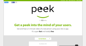
Peek by User Testing is a tool that can help you do this for free. If the feedback is unanimously negative, you know you have a design problem that needs fixing.
If you would rather go with a custom design (you must have a good reason for choosing this over a theme), don’t just go with any web service provider you come across, talk to existing customers, and do your research to find out if you’re getting a good deal.

If you’re on WordPress, the obvious step is to purchase a newer theme from a marketplace such as ThemeForest—look for a clean, modern, and responsive design with a focus on clean code.
Check the ratings and reviews of both the theme and the theme creator before making your purchase.
Other common design problems that you must identify and eliminate include unintuitive navigation, poor choice of fonts, and a bad color palette. Choosing the right fonts is especially important for readability and user experience- consider using resources like Picsart Fonts to find clean, professional fonts for your website. Remember that good design doesn’t have to be flashy but functional, and less is often more.
2. Low-Quality Content
Converse to the point above, a good design can make users stick around long enough to read your content, but it can’t make them stay there—only great content can.
Bad practices such as using article spinners and outsourcing work to content farms (the ones that promise to deliver an 800-word article for $2) are the reason most blogs and websites sound like a copy of a copy of a copy.
How to fix it
First, if you haven’t got anything original to say, don’t say it. The internet is already filled with enough noise and it does not need more of it.
Before you publish anything, work on a content strategy that defines what you’re going to publish and why you’re publishing it. This will help bring a focus to your content and help differentiate you from your competitors.
Stop producing mediocre content. It’s better to publish one great post instead of 10 that are badly conceived and poorly written.
If you look at any outstanding web publications (Smashing Magazine, Boost Blog Traffic, A List Apart to name just a few), you will quickly realize that the thing that makes them so popular is the exceptional quality of what they publish and not the frequency.
If you are going to outsource the content, don’t dish it out to content farms; instead spend time on finding freelance writers who are actually good, even if a bit expensive.
Marketplaces such as Content.ly that focus on quality are something you could consider—yes, they do tend to cost more, but what you spend is what you get.
3. Slow Page Load Speeds
Two seconds is all you get before your readers start bouncing off your website if the page they requested does not load.
Seems unrealistic? Fine, give it three seconds, but now you’re really gambling—roughly 40% of users will leave, and then it only goes downhill from there.
Page abandonment is terrible news for publishers as it increases bounce rate, decreases ad revenue, and generally throws a wet towel on all their hard work.
How to fix it
Thankfully, there are a few steps you can take to rectify this problem pretty easily. The first thing you should do is run a speed test.
Go to GTMetrix, enter your site URL, and hit enter. If your page load time is anything above 3-4 seconds—you know there is scope for improvement.
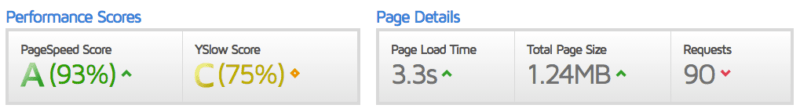
Another thing you should keep an eye out for is the number of HTTP requests during page load, if the number seems too high (70 is the average), it indicates a structural problem with the way your site is set up, either that or the page is cluttered with too many media elements. Either way, you need to clean up.
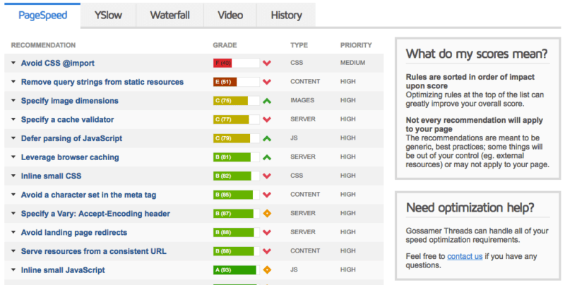
Just below the results, you will see two tabs called PageSpeed and YSlow, these tabs will show you a breakdown of the speed bottlenecks on your website, along with recommendations on what you can do to fix them.
You should notice a marked improvement is page load speeds if you implement these suggested changes.
If your website is on WordPress, you should use a good caching plugin such a W3 Total Cache or WP Super Cache to further speed up your load times.
If you tend to use a lot of images in your post, BJ Lazy Load will load them as the user scrolls closer to where they are localted, this saving both time and bandwidth.
Finally, for mobile devices, consider implementing Google Accelerated Mobile pages, this will make a huge difference on the speed and fluidity of how your web pages load on mobile devices.
4. Badly Placed Banner Ads
In an ideal world, there would be no ads, but this is not an ideal world and as a publisher, you need to earn money to keep your operation going.
That being said, there is absolutely nothing that will make your users run away faster from your website than badly places ads or annoying pop-ups. It’s the single biggest website killer that exists.
Surprisingly, bad ad layouts are not limited to newbie publishers, even big media houses litter their web pages with huge rollover ads that obscure the content to a point that you’re left with no choice but to give up and abandon the page.
How to fix it
With some effort, it is possible to run ads without disrupting the user experience. You have to find the right balance between optimizing ad revenue and giving your users a good, uncluttered site experience.
The first thing you must realize is that more ad units do not necessarily equal to higher revenue; in our tests, we have found publishers with fewer ad units generating higher revenue compared to those with more ad units and comparable traffic. The difference?
The former have spent time testing their ad layouts instead of making random bets.
To this effect, you can run manual tests in AdSense, though they can get tedious pretty quickly. Our tool, AdPushup, lets you run automated tests to select the best-performing ad units so you don’t have to.
Pro tip: Experiment with placing banner ads inside your content, our data shows that ads here perform surprisingly well
There are two more things you can do to buffer the negative impact that ads can have on your website’s user experience:
- Avoid ad types that are universally known to be intrusive
such as pop-ups and rollovers. The extra money you do generate will be at the cost of alienating users.
- Explore non-traditional means of generating revenue
such as sponsored reviews, native ads, content recommendation systems, and affiliate marketing among others. These will help you bump up your earnings without significantly ruining your user experience.
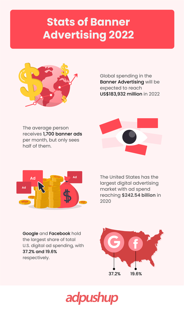
Here’s an interesting banner ads statistics for you:
FAQs
Banner ads use images to grab attention, market your brand, and drive traffic to your website. As you can see in the example below, any text, such as ad copy or a call to action, is usually embedded within the image.
Banner ads are placed in high-traffic locations on web pages, creating brand awareness and generating click-throughs, purchases, and leads. These high-visibility locations include the front, bottom, or the side of a webpage; places where the eyes of browsers usually wander.
Most networks sell “run of site” ads to advertisers for about $5 CPM. The network then takes a 30% to 50% cut of the $5. Thus, you might expect to earn 0.3 cents per impression on your site, or $3 CPM.

Shubham is a digital marketer with rich experience working in the advertisement technology industry. He has vast experience in the programmatic industry, driving business strategy and scaling functions including but not limited to growth and marketing, Operations, process optimization, and Sales.