Advertising and banner design professional Tuan Nguyen shares his top tips for increasing the clickthrough rates of your banner ads.
Banner ads were first introduced some 20 years ago and have been an inseparable part of the web ever since.
However, there has been a continued decline in banner clickthrough rates, which where around 78% in 1994 and have fallen to 0.1% now.
This is largely due to the fact that banners were a novelty in the past and if anything, consumers love novelty and innovation. By now, ads have become so common that 92% of users don’t even notice them when surfing the web.
Don’t let those statistics get the better of you though, banner ads still work, they just require more work and dedication than before.
Before we dive into tips for increasing banner ads CTR, here are few interesting banner ads statistics:
1. Put Yourself in Your Readers’ Shoes
When designing your banner ad, take the time to think from your readers’ perspective. What would they require to see/read to actually click the ad?
It doesn’t matter how much you like or dislike the banner ad, it’s more important how consumers will react to it.
Consumers are very picky about what they click nowadays, and in order to achieve a good click rate, you will need to think about something that:
- Interests/intrigues them
- Is relevant to their needs
- Grabs their attention
Always think from your readers’ perspective and not your own.
2. Visuals Matter: Use Only High Quality Images
We live in a visual word. The quality of your images have to be top notch to evoke interest.
Think about it for a moment: If you see a banner ad with a low quality image, which also makes the text harder to read, you will probably think that this advertiser isn’t trustworthy enough and won’t even consider that maybe he just doesn’t have the budget to get better images, right?
That’s exactly what users will think. It’s like solving one problem, but nullifying its results with another – you manage to overcome banner blindness with proper ad placements and grab your users’ attention, but instantly lose your momentum due to low quality images. Not the best tradeoff if you ask me.
Determining the right advertising budget can be a little tricky, but it’s well worth your time. If you don’t want to invest a proper amount of money into your ads, how can you expect to gain the trust of your users or improve your clicks?
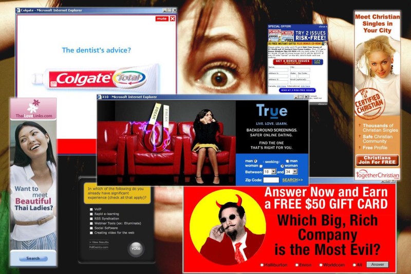
3. Use Big Chunks of Text to Make Your Banner Stand Out
I know this might sound contradictory, since banner ads are designed in a way to give information to a user with as little words as possible, but the problem is that this has become way too mainstream.
Let’s recall: What do customers value most? Right, it’s novelty, or rather something that isn’t common to their eyes.
Here is a good example of what I mean (source):
Yes, it’s an ad for placing banner ads, but it’s very clear and tells you exactly what to do and what you will get (assuming it’s true).
Using big chunks of text can be a great idea to grab attention and explain your product/service in much more detail.
You will have the opportunity to provide more information to a user, which will hopefully convince him to click the ad and also surprise him by a bit of novelty that is so important.
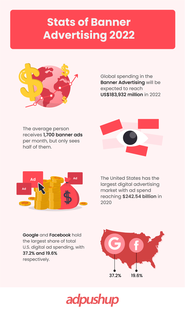
4. Don’t Overcrowd Your Banners With Too Much Information or Colours
Your banner ads must be easy to read, understand, go easy on the eye in terms of colors and quantity of information, etc.
To make everything more visual, here is an example of what your banner should NOT look like (source):
This banner has a number of problems:
- Indistinguishable brand name
- Too much information
- No call to action
- Low image quality
- Unreadable text at the bottom (it says something about offer expiry date, but you can’t even see it)
- More than 9 colors used (its uncomfortable to look at)
Now, let’s take a look at a banner ad that is much clearer than the previous one (source):

Here is how Gillette nailed it:
- Clear brand name
- Clear value proposition
- Clear, eye catchy CTA
- Good image quality
- Easily readable
- Variations of 3 colors used
Key takeaway: Use a single CTA, a single purpose and concentrate the attention of your users on as few elements as you can to deliver your message clearly.
Fonts and text size play a big role. Pay attention to what font and text size you use in your banners.
When it comes to online advertising, simpler fonts are usually the way to go, but that’s not always the case. If you are a wedding planner for instance, you might want to use more fancy looking fonts and bigger letters to match the wedding mood.
Take the time and experiment with different fonts and text sizes to determine which suits your business best.
5. Get Your Banners Noticed With Proper Placement
Over the years, people have evolved to navigate websites very effectively in search of information they require.
People usually scan the website in just about 3 seconds to determine whether it contains something helpful for them or not.
According to a study by NN/g, users view the left side of the page 69% of the time as opposed to the right part of the page (31% accordingly).
Also, the top part of a webpage is the first place where people look when browsing. This is the reason why website navigation (menu), contact and pricing information is usually located at the top parts of almost any website.
Try placing your banner ads at the top of the page or if that’s impossible, choose left side over right every time.
6. Adding a Price on Your Banner Isn’t Always a Great Idea
One may think that having the price of the product or service illustrated on the banner is a good idea (especially when the price is low).
It will tell users how much value they can get for an astonishing price and it should drive them to click the ad right way.
Except that’s not the case most of the times. Users, even qualified leads, are willing to make a purchase, but still want to know more about the product before they do.
Even low price isn’t always a winning scenario: Many people correlate low price to low quality, something that may affect their click decision negatively.
Instead of showcasing the price, focus on intriguing people with your banner, which will take them to a page where they can find more information about the product you are offering and then give them the price.
Both high and low prices have a tendency to scare consumers away, rather than pull them in.
7. Make Proper Use of Colour Psychology
There are a number of different studies regarding this subject and there are certain rules that apply to colors when it comes to associations and information interpretation.
For example red color symbolizes warmth, strength, excitement and aggression, while green stands for balance, harmony, refreshment and peace.
Experiment with various combinations and choose different, matching colors for each new ad.
This will not only help illustrate the uniqueness of your banners (which technically means that every banner offers something else, not the same thing as the previous one), but also add some variety so that all your ads won’t practically look the same to the untrained human eye.
8. Free Stuff Always Works
Isn’t it wonderful, getting even a little bit of value for completely free? That’s exactly what every person wants. Free samples, products or limited availability free offers are a great way to increase your clicks rates.
In those cases, you can even go as far as showcasing the previous price (at which the product is normally available) and make sure to tell users how long the offer will last.
9. Keep Mobile in Mind
Another reason besides banner blindness why banner ads get ignored by people, is that most of them use their smartphone or tablet to surf the web.
Since most banners include some kind of animation in them, developers and designers use Flash to create that animation. But the problem is that most of the mobile devices and tablets don’t use Adobe Flash, which basically means that your banner cannot be seen by smartphone users.
A solution to this problem is to hire a designer (or an agency) that can create animated banners without using Flash and instead using HTML 5 for example.
You probably know that mobile internet browsing already surpassed desktop at the end of 2014, and this is a sure sign that the number of mobile users will continue to grow.
In addition to this, there is always a chance that your ads aren’t optimized for mobile viewing (even if they are creating using HTML 5) and people will still fail to see them. Make sure to take care of all the technical aspects of your banners like you do with design and proper placement.
Conclusion
I want to offer you a short summary on how to increase your banner ad clicks:
- Think from the users’ perspective when creating your banner, pay attention to the placement of your ad and make sure that it’s optimized for mobile.
- Fonts, colors and text size matter and vary across different industries.
- Avoid using any pricing information on your banner, instead, make sure that it’s easy to read, has a single purpose and a defined, clear CTA.
Banner ads aren’t dead, despite everything that you hear and read on the web. It just takes a bit more time, effort, and dedication to create a banner that will truly resonate with your audience.
This is a guest contribution by Tuan Nguyen, an advertising and banner ad design professional and the founder of 20dollar Banners.com, a banner design agency. Tuan has helped thousands of individuals and businesses grow with the help of banner ads over the past years.
FAQs
The key to improving CTR is to pull one of three levers: Keyword choice and match type. Ad copy language. Audience selection and targeting.
In most industries, the click-through rate is between 4 and 6%. Google Ads click-through rates should be at least 6-7%.
Your CTR is calculated by dividing the number of clicks you receive by the number of impressions you receive: clicks ÷ impressions = CTR. Your CTR would be 5% if you had 5 clicks and 100 impressions.
A growth blog for professional bloggers and ad ops professionals.