Often times we find ourselves spending hours crafting articles, making sure that each word we select is the perfect one to project the story we are trying to paint. But there is another factor, often overlooked, that is just as important as writing great content: Typography.
Let’s delve a little into the world of typography and see how it affects readers. If you are someone who despite getting traffic and producing quality content, just can’t seem to get your readers to stay, you will want to read this till the end.
Typography: What is it exactly?
The term typography might seem unfamiliar to many, but a content piece that is not typographically structured will not sit well with many readers: including those who have no idea as to what it means.
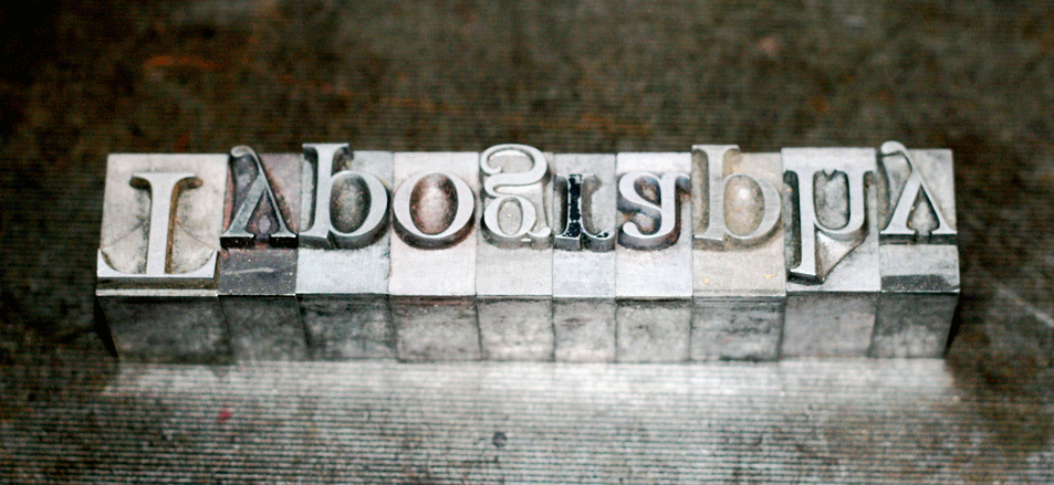
In simple terms, typography refers to the craft of arranging type. It has been practiced since the invention of Gutenbergs’s movable type printing machine. Despite not always produced by professional typographers, typography is present in varying lengths in almost all text pieces.
Typographer, Adrian Frutiger, puts it perfectly when he says:
“If you remember the shape of your spoon at lunch, it has to be the wrong shape. The spoon and the letter are tools; one to take food from the bowl, the other to take information off the page…when it is a good design, the reader has to feel comfortable because the letter is both banal and beautiful.”
Typography is a tool that can add emotion, drama and personality to the printed matter, making it more visually appealing. It can subconsciously embed the message in the mind of the reader, making it easier for them to understand, grasp and comprehend the presented information.
Let’s look at the key elements of Typography:
- Typeface: This is a term that is commonly confused with “font”. Typeface refers to a collection of symbols, characters, numbers and letters that share the same design. It is a family of fonts that share similar features. Examples of a typeface include Baskerville, Helvetica and Garamond.
- Font, on the other hand, refers to a typeface that is set in a specific size, style and weight. For example, Baskerville Old Face Bold at 11 points is a font. So the next time when someone asks you for your favorite font, know that they actually might mean typeface.
- Line Length: Often calculated as number of words or characters in a line, line length refers to distance occupied by a block of text located between the right and the left margin.
- Leading: Also known as line spacing, leading refers to the distance between baseline to baseline. A baseline is an imaginary line where the text (of a line) rests.
- Kerning: Kerning refers to spacing between individual characters or letters.
- Tracking: Also known as letter-spacing, tracking is almost the same as kerning but applied to a block of text, instead of individual letters.
Why does typography matter?
To put it simply, typography matters because it helps keep the reader’s attention on your content. Good typography allows them to focus on the message instead of focusing on the mechanics of reading.
Typography is more than selecting fonts. It is the study of how humans read, how they perceive information, how they recognise words and how the brain processes the information. Yes, it is an art but it is has its roots in human cognition.
For example, as you know, creating a visual hierarchy is important to guide the readers’ attention. Typography allows you to create that visual arrangement in the order of importance, by providing them with visual cues through the use of color, font, size, alignment and style.
To understand how to best utilise typography when creating a visual hierarchy, it is important to understand how people perceive information, which can be observed through the Gestalt’s principles of Perception which state that human brain likes to organize elements on the basis of similarity, continuation, closure and proximity.
There are many other aspects of typography whose knowledge and therefore application can improve reader engagement. The common one is selecting the right typeface. Other than that, organisation of text is equally important to provide a pleasant reading experience. When organising text, you must aim to achieve optimal reading experience, conspicuity while keeping the passage aesthetically pleasing.
Well arranged content will allow the reader to understand all the different “parts” of the content, while making mental processing easier.
As far as conspicuity goes, there is one specific thing you want to achieve through typography. You want to make sure that the paragraphs or texts that are important are clearly emphasised to be more important than other elements present on the page. You can do this by bolding, underlining or even increasing the font size of those sections. You can even do it by creating an environmental contrast, which means to make the surrounding area of the important passage different in appearance.
What does research say?
It is true that words are powerful, but the way the information is presented is important as well. There is no better story that testifies to this statement better than the case of Higgs Boson a.k.a. “The God Particle”.
The quest to find Higgs boson was one of the most expensive particle physics project ever undertaken by the CERN researchers, yet when the time came to declare the discovery of Higgs Boson particle, they did it via a font family that everyone just loves to hate: Comic Sans. Many twitter observers, along with the font’s creator, Vincent Connare, were angry at the way this groundbreaking discovery was announced. In fact, people were so infuriated that within an hour Comic Sans became a trending topic on Twitter, leaving “God particle” behind.

In the July of 2012, writer and film maker, Errol Morris, ran an experiment in New York Times titled “Are You an Optimist or a Pessimist?”, in which the participants were shown a brief passage followed by the premise “Is it true that “we live in an era of unprecedented safety?””. Participants were then asked whether they supported this claim, and how confident were they in their choice.
Approximately 40,000 participants took the quiz. The surprising twist, though, was that Errol Morris was not really interested in Optimism vs Pessimism. Instead, he was really interested in finding out whether different typefaces influenced the respondents’ answer, or made the facts more believable. The passage appeared in different typefaces: Baskerville, Computer Modern, Georgia, Helvetica, Comic Sans and Trebuchet- across the participants.
The results showed that people who saw the statements in Baskerville were more likely to agree with it. Helvetica and Comic Sans, unsurprisingly, failed to inspire confidence. In fact, Comic Sans had the lowest rate of agreement and highest rate of disagreement.
Baskerville was the clear winner.
When Morris asked David Dunning, a psychology professor at Cornell who helped design the questions for this experiment as to why he thought Baskerville won, he said, “Fonts have different personalities. It seems to me that one thing you can say about Baskerville is that it feels more formal or looks more formal.”
Bloggers
Understanding Typography is crucial for Bloggers. Know that every typeface has its place to shine. The font you select should complement the text and not overpower it. Typefaces have the power to ignite associations and thoughts in the readers just by their appearance.
Does (Font) Size Matter?
In a study by Bernard, they compared 8 popular typefaces to find which performed the best and at what size. The fonts that were compared were Century Schoolbook, Courier New, Georgia, Times New Roman, Arial, Comic Sans, Tahoma and Verdana. These fonts were compared at 10, 12 and 14 point sizes.
Results were as follows:
At 10 point size, Verdana was the most preferred font.
At 12 point size, Arial was the most preferred font.
At 14 point size, Comic Sans was the most preferred font.
When the reading time for the fonts were analysed, it was found that Times New Roman and Arial were read the fastest.
The analysis of reading efficiency showed larger texts more readable even though data did not yield any significant results.
As far as perceived legibility goes, at font size 10 Tahoma was the most legible. At font size 12, Courier was the most legible, and at font size 14 Arial was the most legible. Out of all fonts, Arial and Courier were shown to be most legible. But overall, this study showed that a bigger font size does not always equal to a high legibility.
Picking the right typeface:
- Looks aren’t always the best choice. Often people go for the typeface that looks different, is unique and strikes a chord with them with its distinctive personality. Is that always the best choice? Not always. There should always be a balance between expressiveness and usefulness when it comes to the font.
- What if you want to pair typefaces? The best way to do it is through a design principle called correspondence and contrast.
-
- The first way to mix typefaces is by pairing two that match, or are different enough. For example Helvetica and Franklin. If the typefaces you choose to go with are too similar, then your reader subconsciously will compare the two fonts to see if they are similar, thus distracting them from comprehending the actual message of the content piece.
- The second way to do it is by pairing typefaces that contrast but still complement each other. You can do it by grouping types that share a common trait, like x height or kerning, but is still different in all other factors.
-
- Do not Overdose. With the amount of variety available, it is easy to fall with the shiniest font you first lay your eyes upon. The curls and swirls that enticed you to the typeface are powerful so use them in small doses. Otherwise, you stand to risk legibility and readability. Try to keep the body simple.
- Remember that there are no ironclad rules. What’s mentioned above are guidelines, but feel free to experiment and tweak your layout based on results. The font that hits the spot for someone’s audience might not work well with yours.
Serif vs. Sans-Serif problem: Which is Easier to Read?
Over the years, research has failed to produce any conclusive results when it comes to deciding which one performs better. But what is the common consensus when it comes to the legibility war between Serifs and the Non Serifs?
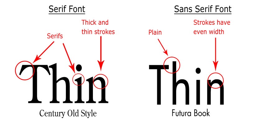
Sans Serif is the way to go when it comes to the web. Some research has shown that Sans Serif fonts are easier to read on computer monitors because they are less visually complex, it requires less time to be processed by the brain which means that the person is able to focus more on the message than trying to decipher the characters.
Another reason why Sans Serif performs better on web is because they are more legible in small sizes. They are legible because of their simplistic forms. Use of Serif typefaces on low resolutions screens can even cause visual dissonance, retracting the readers from reading the whole passage.
Keep the Serifs for the title and San Serifs for the body.
Also, study your audience. What are their demographics? Are they scientists, lawyers, doctors or preschoolers? Comic Sans might sit well with kids but not lawyers. Also, know that typography is very important to create a mood and feeling around the content. So use it wisely!
Effect on Mood and Cognitive Performance of readers
An experiment conducted by Kevin Larson and Rosalind Picard looked at how typography affects mood and performance of the readers. It happened across two studies, where they took three kind of measurements: Relative Subject Duration (RSD), Likert Scale and through a cognitive task which was different for both studies.
There were twenty participants, half of them got the text with poor typography and half got good typography.
In the first study, the participants were given twenty minutes to read the passage, amid which (after 15 minutes) they were interrupted and asked to estimate how long they had been reading for. After the RSD data was recorded, they were asked to fill out the Likert preference questionnaire with 6 statements, where one of the statements was whether they found the text easy to read.
Next, they were given a cognitive task, which for the first study was a Candle problem.
The second study was very similar to the first one, except for the RSD data, they were interrupted 17 minutes into reading, and the cognitive performance task was changed to remote associates test.
Results
- Participants with good typography underestimated their time by 3 minutes 18 seconds in the first study and by 5 minutes and 21 seconds in the second study. This shows that when a passage is well structured, the readers are more engrossed in the text.
- With the Likert scale questionnaire in the first study, the results were not reliable. But in the second study, some scores were in favor of good typography.
- For the Candle problem, out of the 10 participants who were shown good typography, 4 successfully completed the task, while 0 participants completed the task in the other group.
- In the Remote associates task, the results were not statistically significant or reliable with the good typography group succeeding on 52% of the task at an average speed of 6395ms, and the poor typography group succeeding at 48% of the task at an average speed of 6715ms.
Even though the result was not reliable enough in the second study, the good typography group did perform better. This can be attributed to the fact that they were in a better mood before starting the task. Hence, they were better at problem solving.
Legibility vs Readability
Legibility looks at the fine details of a typeface, and focuses on how individual characters are identified, while readability looks at layout of the complete word or text as a whole.
Guidelines to make your text more legible and readable
- Pick a typeface with an average x height.
- Keep the counters large. Counter refers to the negative white space present within the letter, like in “O” or “P”. A large counter will make the characters more distinctive.
- Simple letter types are easier to read. Sans Serif fonts are often used for online reading. Although, Serif is easier to read on printed text.
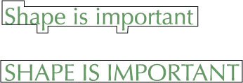
- Avoid caps and keep the coastline. Coastline refers to the shape that the boundary of a word makes. All in Caps does not have a coastline, which makes its recognition harder. Over 90% of the text that people read is in lowercase, so that’s what they are used to. Also, the coastline provides the readers with a word’s shape, a visual cue, which they recognise.
- Depending on your readers’ demographic, adjust your point size. If your readers are older, you should increase the point size. Otherwise depending on the font, point size between 10-14 should be reasonable.
- Remember line length? It affects both reading speed and comfort. Lines that are too short can make the readers uneasy due to the constant need of shifting their eyes onto the next line. It can affect comprehension. Lines that are too long, on the other hand, can make it difficult for the readers to find the next line.
- When text lines are very long, the line spacing should be higher so that the reader lands on the next line correctly without getting lost.
- Letter spacing is very important to have the right density, which allows smooth word recognition. Type with high density will allow for more words per line, whereas those with low density will only allow a few words. But if the spacing between letters is too far apart, the reader will read the letters individually and then form a word, taking two steps instead of one. As a general rule of thumb, line spacing should be 120% of the font size.
- Organize the headlines, sub headlines and the body with font size. This way all three of them remain easily distinguishable.
- Regardless of the font type, having an even rhythm of space throughout the characters is very important for a smooth readability.
As Webmasters, Publishers and Bloggers, we want to make it as simple as possible for the readers to understand information. Strategic use of typography can make the reading process effortless.
Typefaces can create identities and induce moods that the readers will always associate with your website. So use them wisely.
Lastly, know that in the world of Typography everything is evolving. There are no rules but only guidelines. Creativity is essential. If the entire web were written in Sans Serif, it would be one boring canvas. With Typography: Test, Experiment and Be Creative.
Ankit is a co-founder @ AdPushup (a tool which helps online publishers optimize ad revenues) and loves online marketing & growth hacking.


